
SKILLS
TOOLS

OVERVIEW
Salisbury Station is a typeface designed to create a consistent typeface for Historic Salisbury. The typeface reflects the historic nature of Salisbury and reflects the nature of Salisbury throughout time. The process began with the evolution of the letterforms developed from inspiration, to starting sketches, to transferring the letters to vellum, and then digitizing the letters into a functional, workable typeface. After completing the typeface, we were tasked with collaborating with my peers to create a Type Exhibition show, Mosaics.
RESEARCH & SKETCHES
After defining the problem of inconsistent typefaces for Historic Salisbury, finding a solution that was able to used in the different places of uses and reflected Salisbury, North Carolina and all that it stands and has stood for was important.
I began the process with researching Salisbury's History and defining key and consistent events and characteristics of the town.
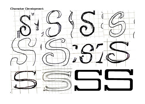
In collecting this information and then synthesizing it, I found a pattern of industrial and wide shapes both in the historical buildings, in the history of places and events, as well as archived images and typefaces.

DIGITIZING
After Vellum, transferring the letterforms to Adobe Illustrator and building them out, I continued to make changes the characters to make them feel more consistent together and work together. Testing the letterforms by building out words and seeing how letters work together and then adjusting them as needed as well as the kerning in between the letters and finding what looks best.

MOSAICS
SETTING UP
@SCSA_MOSAICS
@AUTYPEFOUNDRY
EXHIBITION CURATIONS
MY ROLE

OVERVIEW
Mosaics is a typographic specimen exhibition show designed for displaying student made typefaces.
As a collective we ideated on the theme mosaics to represent the typefaces present and the group as individuals as well.
As a team we divided the tasks of the exhibition into 3 categories of branding, production and exhibition curation.
COLLABORATORS:
LEAH WIGLEY, KENNEDY ROUSH, LILY CAYTON, ASHTON CROCHET, DANIEL FORREST, OWEN HODGES, RHENA JOHNSON, SOPHIA KINARD, AUBREY PARTAIN, BAILEY PERRITTE, ELLA SIRAGUSA


MOSAICS EXHIBITION SPACE

Digitizing
After Vellum, transferring the letterforms to Adobe Illustrator and building them out, I continued to make changes the characters to make them feel more consistent together and work together. Testing the letterforms by building out words and seeing how letters work together and then adjusting them as needed as well as the kerning in between the letters and finding what looks best.

VELLUM
After research and many iterations of sketches for the potential look of the typeface, we choose the sketches to turn into the potential final typefaces, and transferred them to vellum, for a round of critique to continue to make the forms more consistent.
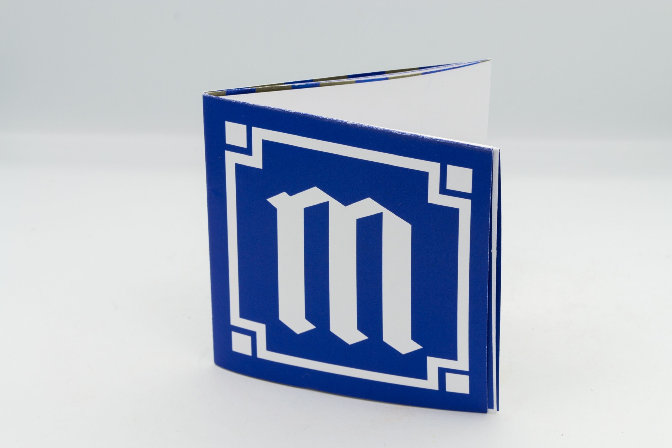
After completing the typefaces, we were tasked in making a type specimen book, explaining our process and to show others the typeface in use, to be displayed along side our typefaces in our Exhibition.
SKILLS
TYPE DESIGN
EXHIBITION DESIGN
AUDIENCE
ALL
TIMELINE
8 WEEKS
TOOLS
TOOLS
ILLUSTRATOR
INDESIGN
FONTSELF


Salisbury Station is a typeface designed to create a consistent typeface for Historic Salisbury. The typeface reflects the historic nature of Salisbury and reflects the nature of Salisbury throughout time. The process began with the evolution of the letterforms developed from inspiration, to starting sketches, to transferring the letters to vellum, and then digitizing the letters into a functional, workable typeface. After completing the typeface, we were tasked with collaborating with my peers to create a Type Exhibition show, Mosaics.
After completing the typefaces, we were tasked in making a type specimen book, explaining our process and to show others the typeface in use, to be displayed along side our typefaces in our Exhibition.
MOSAICS
OVERVIEW
Mosaics is a typographic specimen exhibition show designed for displaying student made typefaces.
As a collective we ideated on the theme mosaics to represent the typefaces present and the group as individuals as well.
As a team we divided the tasks of the exhibition into 3 categories of branding, production and exhibition curation.
COLLABORATORS:
LEAH WIGLEY, KENNEDY ROUSH, LILY CAYTON, ASHTON CROCHET, DANIEL FORREST, OWEN HODGES, RHENA JOHNSON, SOPHIA KINARD, AUBREY PARTAIN, BAILEY PERRITTE, ELLA SIRAGUSA
@SCSA_MOSAICS
@AUTYPEFOUNDRY
EXHIBITION CURATIONS
MY ROLE


VELLUM
After research and many iterations of sketches for the potential look of the typeface, we choose the sketches to turn into the potential final typefaces, and transferred them to vellum, for a round of critique to continue to make the forms more consistent.


RESEARCH & SKETCHES
After defining the problem of inconsistent typefaces for Historic Salisbury, finding a solution that was able to used in the different places of uses and reflected Salisbury, North Carolina and all that it stands and has stood for was important.
I began the process with researching Salisbury's History and defining key and consistent events and characteristics of the town.
In collecting this information and then synthesizing it, I found a pattern of industrial and wide shapes both in the historical buildings, in the history of places and events, as well as archived images and typefaces.
Digitizing
After Vellum, transferring the letterforms to Adobe Illustrator and building them out, I continued to make changes the characters to make them feel more consistent together and work together. Testing the letterforms by building out words and seeing how letters work together and then adjusting them as needed as well as the kerning in between the letters and finding what looks best.
Salisbury Station is a typeface designed to create a consistent typeface for Historic Salisbury. The typeface reflects the historic nature of Salisbury and reflects the nature of Salisbury throughout time. The process began with the evolution of the letterforms developed from inspiration, to starting sketches, to transferring the letters to vellum, and then digitizing the letters into a functional, workable typeface. After completing the typeface, we were tasked with collaborating with my peers to create a Type Exhibition show, Mosaics.
After completing the typefaces, we were tasked in making a type specimen book, explaining our process and to show others the typeface in use, to be displayed along side our typefaces in our Exhibition.
MOSAICS
OVERVIEW
Mosaics is a typographic specimen exhibition show designed for displaying student made typefaces.
As a collective we ideated on the theme mosaics to represent the typefaces present and the group as individuals as well.
As a team we divided the tasks of the exhibition into 3 categories of branding, production and exhibition curation.
COLLABORATORS:
LEAH WIGLEY, KENNEDY ROUSH, LILY CAYTON, ASHTON CROCHET, DANIEL FORREST, OWEN HODGES, RHENA JOHNSON, SOPHIA KINARD, AUBREY PARTAIN, BAILEY PERRITTE, ELLA SIRAGUSA
@SCSA_MOSAICS
@AUTYPEFOUNDRY
EXHIBITION CURATIONS
MY ROLE
VELLUM
After research and many iterations of sketches for the potential look of the typeface, we choose the sketches to turn into the potential final typefaces, and transferred them to vellum, for a round of critique to continue to make the forms more consistent.
SKILLS
TYPE DESIGN
EXHIBITION DESIGN
AUDIENCE
ALL
TIMELINE
8 WEEKS
TOOLS
ILLUSTRATOR
INDESIGN
FONTSELF
SKILLS
TYPE DESIGN
EXHIBITION DESIGN
AUDIENCE
ALL
TIMELINE
8 WEEKS
TOOLS
ILLUSTRATOR
INDESIGN
FONTSELF

SKILLS
TYPE DESIGN
EXHIBITION DESIGN
AUDIENCE
ALL
TIMELINE
8 WEEKS
TOOLS
ILLUSTRATOR
INDESIGN
FONTSELF